How did you use media technologies in the constructions and research, planning and evaluation stages?
Throughout the creation of my product of a ancillary task and a music video, I have used an intense variety of media technologies for the construction of research, planning and evaluation, allowing me to create successful products. Having not took Media for GCSE, I feel I lacked experience for my AS studies therefore I was unaware of the variety of technologies I could use in order to better my product each time I edited. Therefore comparing my AS and A2 productions you will be able to see a drastic change as my A2 production I used much more varied techniques which have affected my layout, and the format of my blog as I've fit the theme/genre of my music video to continue through my blog which allows the product to look much tidier allowing it easier for others to view.
SoftWare
Blogger- Blogger allowed me to post research in both the creation of my products in AS and A2 where I had researched the history of thrillers and music videos and famous directors, educating myself on how to create a successful product which relates well to the genre and target audience, blogger allowed me to present the source of information in a quirky and interesting way, however analysing both my AS and A2 product, I used blogger much more technically in A2 than I did AS. Whilst creating my AS production there were some problems with the uploading of videos and images. The videos took several hours to upload on -to my blog, or they did not load at all or they did not play. Whereas for my A2 production I acknowledged the problem and uploaded my videos in a smaller memory which allowed the video to upload quickly and play. During AS I had problems with my images I had chosen to upload as some uploaded blankly, or they were not a focused picture and were slightly blurry, and I felt this did not do my product justice, therefore i had to upload several different versions of the image to find a good image. Therefore for A2 instead of copying and pasting the image on to the blog, i saved the image and then uploaded the image which allowed the image to be of good quality. Also due to a better layout my blog for my A2 production is a lot more easier to navigate as my blog, as all my work is in chronological order and named correctly, which allows readers/audience to understand and enjoy my blog much more.
IMovie- I used IMovie for the creation of both my Thriller opening 'Stalker' for my AS production, and my Music Video 'Golden drops' for my A2 production. However the way I used IMovie varied for both my productions as I lacked editing skills for my AS product and therefore you could tell this in my final product. Whereas for my A2 product I was educated more on advanced tools, transitions, editing skills such as brightness, colouring and other effects which helped make my product look more professional. My AS production was a lot more simple, as I used basic editing skills, I did not play around with different colourings/editing skills which would of helped intensify the atmosphere which is a key aspect thrillers use. Therefore for my A2 production i was educated much more on advanced tools, therefore enabling me to to explore different editing effects which fit well with the genre of my music video (House),
Other Software; I also used other software to create posts for my blogs such as prezi, slideshare and also I used software such as photoshop, picasa and gump which allowed me to create my ancillary task which included a digipak and a magazine advert for my A2 production. During my AS production i was unaware of all software available to me, therefore the main one I used was prezi and I only used that a little, therefore my blog was presented quite boring and including a lot of writing. Whereas for my A2 production after researching into other softwares, I found a lot more softwares such as slideshare, picassa, powerpoint and videos were much more interesting ways to present my work keeping my blog busy, which also relates well to my chosen genre (house), as house is a fast beat genre constantly busy with a different shot or a different beat. Also I have learnt new software like photoshop and picassa which helped me create my anciliary task for my A2 production where i created a digipak and an advert magazine, I found picassa was easier to use as the tools were basic and easy to access, but Photoshop helped me advance my product due to the advanced tools were i could overlay images, sharpen the colour and insert text.
Sunday 10 April 2016
Saturday 9 April 2016
Evaluation 3
What have you learnt from your audience feedback?
In order to gain final ideas for my final product of my ancillary task, and music video I had to gather audience feedback from peers and other audiences in order for my strengths and weaknesses to be pointed out, therefore allowing me to make the most successful product I possibly could. But also this allowed me to acknowledge my target audience's needs, as they pointed out the shots i needed to keep and ditch and guided me to a better and stronger idea. I gathered audience feedback in a variety of ways such as, Teachers feedback, questionnaires, peer feedback and social media.
Questionnaires; Questionnaires allowed me to collect a large amount of primary data which was seen as reliable date. I asked around 20 students both female and male, from the age of 17-21 as these were my target audience and I wanted to appeal to their needs, therefore by asking them simple questions allowed me to acknowledge their likes/dislikes and allowed me to change and improve my product to reach out to them as a target audience more. All questionnaires had the same questions in order to gain reliable data which enabled me to create the most successful product. Although the questionnaires were designed for my overall product, the main focus was my music video, as I needed feedback to make changes to my editing skills and shots to make sure my music video fit the genre of the song I had chosen. Below are examples of a male and female response to the questionnaires which I produced myself;


Surveys; I also held surveys asking seven people all of the age of my target audience (18-21) whether they thought they ancillary task related well with the music video. This enabled me to gather primary research into the positive and negatives of my products allowing me to make changes to better my products. Below is a graph of the results of my survey:

Key comments made:
The majority of people asked thought that my products related well to one another, as the theme of golden was repeated throughout my products which created lyrical meaning behind the song, also they thought the background/setting was used extremely successfully as this created an elegant touch to the music video which was continued into my digipak and magazine advert, which helped towards creating a brand identity for all my products. However some criticism made by Ashley and James, was that all three products have different purposes behind the selling of the song and album itself therefore they felt all three products should of had a different unique twist to help separate each product, giving them all a different selling purpose. Therefore from this audience feedback I learnt that I wanted to keep the theme running through all my products to represent the genre and my chosen song whilst creating a brand identity with my main selling point being focused on the female protagonist, I also learnt that I needed to try and separate each product to give them a different purpose of selling each product.
Teacher and pupil feedback
Audience feedback on my final cut from my fellow pupils and teacher were that some of my shots were still too dark and I therefore needed to enlighten shots to continue the bright, light golden theme. Also some of my lip syncing was still out of time and I therefore needed to continue editing my lip syncing in time with the beat as well as the lip syncing. Also due to my fellow students all creating products of their own this allowed several ideas from themselves which help broaden my imagination creating more inventive shots and helped me play around with the shots for my music video but also my digipak, as a typical convention of my chosen genre is seen to be quite inventive and quirky.

I also received feedback on my other products such as my magazine advert, above is a rejected image that my fellow class mates and teacher agreed that this image was an incorrect image to use for several reasons such as, the title blends into the background taking away the main selling point which is the artist and the title of the song which could potentially affect how much my product sells, also the images are all the same which just causes confusion to the eye and looks unprofessional. Therefore from this feedback helped me create a much better product which related much more successfully to my chosen genre.
Thursday 7 April 2016
Evaluation 2
How effective is the combination of your main product and ancillary task?
For the creation of both my ancillary task and and media product, the main focus was that I made all my products related to one another with a brand identity with a selling point which presented continuity so they were identifiable to the target audience, relating all to one another giving each one of them a purpose. After self analysis and audience feedback I believe that my ancillary task has been successful and I have created a theme with a brand identity in an effective way as not only have I met the typical conventions within my genre I have challenged the conventions by adding my own twist to suit my target audience's needs. Throughout this post I will discuss and analyse my three products and their effectiveness.
This is a prezi to discuss and explore how my products relate with one another:
All three of my products are seen to link with one another through several aspects such as, the main selling point is the female protagonist which is a typical convention of the genre house, the golden theme is also continued throughout all three of my products as this represents the lyrical meaning of my song 'Goldendrops'.
Wednesday 6 April 2016
Evaluation 1
In what ways does your media product use, develop or challenge forms of real media products?
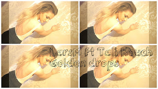
For our A2 course we had been assigned a task of creating a music video with a promotional package, for an existing song with an unsigned artist, of our own choice. We were advised to use an artist who was unsigned and had not already made a music video to our chosen song as this avoided any accusations of copyright. The genre I had chosen was 'House' and the song I had chosen was 'LarsM Ft Tali Kouch - Golden drops'. For our promotional packages we had to create a digipak which was, an album cover and a magazine advert to advertise our products to our target audience. Each of my products have been designed to create the typical conventions of my chosen genre, and media products.
Final Digipak; Throughout the design of my final digipak I have continued the golden back drop representing the lyrical meaning of my chosen song 'Goldendrops' which has continued throughout all three of my products to create a brand identity to my target audience. I have also included typical conventions of my chosen genre house to make my product represent my genre successfully.

Front Cover; When creating my front cover to my digipak I researched into other front covers of other popular house album covers, whilst comparing major successful with not so successful artists as this helped me analyse successful and unsuccessful conventions, allowing me to pick typical conventions making my product professional as possible. The image I chose for my the front cover of my digipak is pleasing to the eye due to the elegant and sophisticated golden tone which is continued throughout all my products creating a brand identity for my target audience. I have also used the same mise en scene from my music video in my digipak such as, the same setting and the same clothing used on the female, this again allows the creation of a brand identity allowing my target audience to be aware of and pick out my products. The title I used is seen to be quite a playful and fun font which represents the genre house well, similarly to all digipaks created by very popular well known artists to not so known artists, normally the fonts used are continued throughout all products which I have also done for my products as this continues the professionalism of my products.
Far Left Insert; This insert is a close up of the young female protagonist portrayed in a fun way with a positive facial expression. I chose to have this image as an insert as It gives the digipak an insight into the personality of the young female, allowing a relationship to be formed with the target audience and the female as they have an insight into her humor. The image is still relevant to the rest of the digipak as the golden theme is continued with the mise en scene like the background/setting but the image differs from the other images. The insert in digipaks usually offer more information into the artist and other protagonist which I feel I have done successfully.
CD; For my CD I chose to use a a dark drop background with an overlay of golden fireworks which are used to represent the lyrical meaning of the song 'Goldendrops'. Although the rest of the digipak has continued the golden theme throughout, I felt the CD needed to be slightly different to the rest of the digipak as this creates a slight twist upon the digipak creating an edgy atmosphere which is a typical convention for the house genre.
Final Magazine Advert; Below is my final magazine advert, I have continued the image through from my digipak to my magazine advert as this creates a vivid and bold brand identity for my target audience. Also i feel this image represents my chosen genre and song well using typical conventions from the genre house by having the main image focusing on the young attractive female protagonist allows a successful selling point for my target audience, as males buy as they aspire to be with her, whilst females buy as they aspire to be her.

Tuesday 5 April 2016
Final Magazine Advert

Above is my Final magazine advert, I decided to continue the theme of the elegant back drop with the main female protagonist as the main focus and selling point, as this continues through from my digipak, and therefore creates a brand identity for my products and my chosen genre allowing my target audience to know of all my products.
Monday 4 April 2016
Digipak Software
For the creation of my final digipak I used several different software's which all contributed to the final outcome, however the two main software's I used were Picassa, GIMP and Photoshop. I used these different software's for a different part off the creation of my final digipak, for example I used GIMP for the overlaying of the images used for my front cover, however Picassa was better for the different editing skills via lighting, whilst also using Picassa for the cropping of my images.
The image below shows the different editing tools Picassa has to offer, which all contribute to making my product look as professional as possible on the low budget available. Having all these editing tools available to me allowed me to play around with the saturation and brightness of the image, creating a fun and quirky style to the digipak which is a typical convention of my chosen genre house. It also allowed me to educate myself on the skills needed to create a successful product, which brought out my creative side which allowed me to further the professionalism of my final product whilst representing my genre well.


The image below shows the different editing tools Picassa has to offer, which all contribute to making my product look as professional as possible on the low budget available. Having all these editing tools available to me allowed me to play around with the saturation and brightness of the image, creating a fun and quirky style to the digipak which is a typical convention of my chosen genre house. It also allowed me to educate myself on the skills needed to create a successful product, which brought out my creative side which allowed me to further the professionalism of my final product whilst representing my genre well.

The image below shows how the software picassa allowed me to insert text within my digipak, however i did not feel the fonts of the particular texts available fit my digipak and the genre I was presenting, enabling me to create a brand identity. Therefore I used a software named Pixlr Editor which had several quirky fonts available which allowed me to find a font that was perfect for my digipak but also for my genre. My chosen font for my final product was 'GroovyF'.

Final Digipak

Above is the final product of my digipak, the main concept of my digipak was to continue the theme from my music video into the digipak whilst also continuing the main focus of the female protagonist. The front cover features the female at a mid shot in front of the background which features heavily throughout my music video this allows a brand identity which helps my target audience pick out my products.
Friday 25 March 2016
Rough Cut - Audience Feedback
For my rough cut feedback I created several audience feedback strategies in order to gather as much feedback as possible. I gathered primary research such as questionnaires, my primary research was aimed at my target audience as these would be the age range interested in my product.
Questionnaires; for my questionnaires I asked 15 people male and female from the ages of 17-23. I asked the same questions on every questionnaire in order to gain reliable data. Here are three examples of questionnaires:


Questionnaires; for my questionnaires I asked 15 people male and female from the ages of 17-23. I asked the same questions on every questionnaire in order to gain reliable data. Here are three examples of questionnaires:


Wednesday 16 March 2016
Rough Cut
Above is my rough cut for my chosen genre, artist and song, I feel that have successfully reached the correct conventions throughout my music video, with the bright colours and fast pace shots fitting well. However there are improvements which needs to be made, for example a variety of nature shots need to be taken out as i feel the focusing on the main female protagonists fits this product better, as she will be the selling point of my product. Also the shots which are edited to be a darker colour also need to be removed and re-edited as the theme of lighting needs to be bright and colourful as for the house genre this is a typical convention. Also the lip-syncing isn't quite on time and therefore needs to be re edited to fit the beat of the song. Also in some shots of the female protagonist need re shooting as the clothing she is wearing does not fit the genre.
Thursday 3 March 2016
Dimensions of a Digipak


Above are three dimensions of a digipak template, for my digipak I intend to have two inserts, a front and back cover and also a CD. Therefore the top image would not fill the my expectations are there are not enough slots for all these requirements I have. The second image of a digipak template as several too many slots and I feel filling in this whole digipak would become too much and to heavy on the eye and would not represent my genre well. Therefore I feel the bottom template of a digipak is the perfect fit for my digipak, as it offers the right amount of slots in order for my digipak product to look professional and be successful.
Rejected Digipak Images

This image was created to be an insert in my digipak, however after further editing I decided to reject this image for my digipak. This is because the glitter does not show in the image which was the purpose for this image, as the glitter presented golden drops. Also the image looks quite boring and dull and therefore I do not feel this would fit in well with the theme of my digipak.

This image was created to be a potential front cover image to my digipak, however this image I later rejected. The image is seen to be to dark and the focus is quite blurry , also the font doesn't quite fit the image. Therefore this rejection allowed me to acknowledge my digipak needs a bright and colourful front cover in order to stand out and catch the eye of my target audience.
Potential Magazine Adverts

Tuesday 1 March 2016
Monday 18 January 2016
Katy Perry- Music Advert Analysis

Main Image; The artist is presented to be in colorful, quite revealing clothing, however the clothing is not presented to be provocative, it is presented to be sexy but sophisticated shown through the the revealing of her legs. She is seen to have a stereotypical pop artist look which is presented through, her pink lipgloss, with a stance pose, brightly coloured shorts and a pink blouse with cherries on. This suggests her target audience is young girls who aspire to be trendy and fashionable like her, whilst also carrying a sense of childlike features. She is also presented to be holding a love heart shaped lollipop, also carrying on a childlike theme, which alludes innocence and fun.
Font; the font used is seen to be large and swirly also quite childlike, but also extremely girly which represents the artists femininity. The use of the color if the font being a red/pinkish color suggests to the audience that the theme of her album and also her magazine advert is love and romance. Also the use of white chunky font to advertise her single and album, grabs the audiences attention to how successful her song and album has been, making the audience aware her music is enjoyable, attracting a variety of audiences.
Colours; The colors used in the advert fits the stereotype of 'pop' music, especially to a female solo artist. Pink, red and baby blue are presented to be the main color scheme, which expresses the theme of innocence and femininity.
Mise en scene; involves props such as paddling pool, rubber ducks and flowers with a pretty white fence. All these features suggest an innocent playful mood which again relates to a stereotypical pop genre. Her target audience tends to be younger people which is expressed through the use of props, as the paddling pool and rubber ducks in particular are associated with younger people to create a fun environment. The setting of the advert is located outdoors which could be seen as a back garden or even the country side, creating a sense of gratification which links in well with with listening to music in general as people like to escape the world they are in.
Saturday 16 January 2016
Subscribe to:
Posts (Atom)